Easyalluvial 0.2.0 released
easyalluvial allows you to build exploratory alluvial plots (sankey diagrams) with a single line of code while automatically binning numerical variables. In version 0.2.0 marginal histograms improve the visibility of those numerical variables. Further a method has been added that creates model agnostic 4 dimensional partial dependence alluvial plots to visualise the response of statistical models.
Introduction
I am happy to announce the release of easyalluvial 0.2.0 with some exciting new features and some minor changes compared to version 0.1.8 Some improvements were made on the default plotting options with improved colors and label size.
suppressPackageStartupMessages( require(tidyverse) )
suppressPackageStartupMessages( require(easyalluvial) )
Marginal Histograms
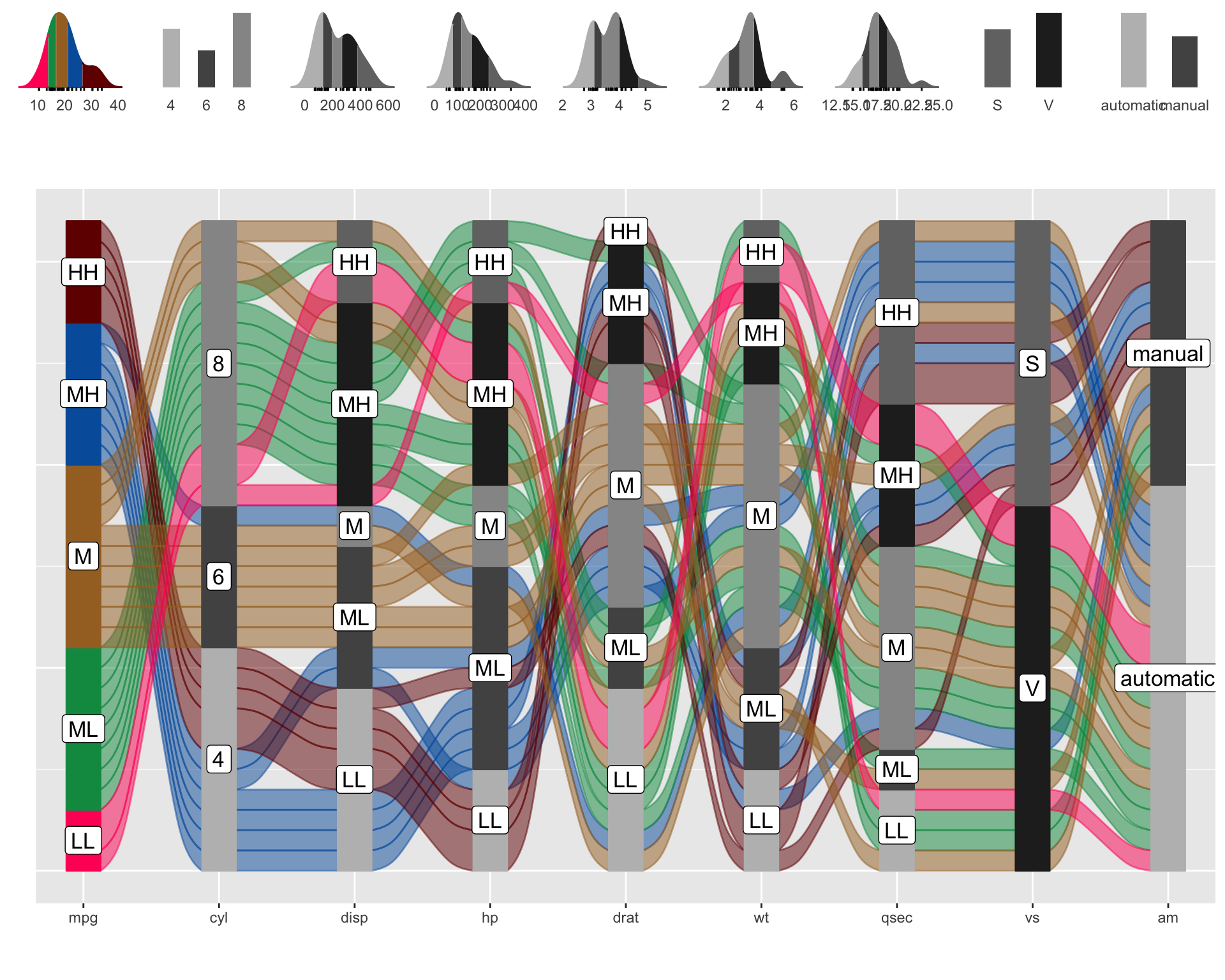
The automated binning of numerical variables hides their distribution. This new feature alleviates that.
p = alluvial_wide(mtcars2, max_variables = 9)

p_grid = add_marginal_histograms(p, mtcars2)
Partial Dependence Alluvial Plots with 4 dimensions
Alluvial plots are capable of displaying higher dimensional data on a plane, thus lend themselves to plot the response of a statistical model to changes in the input data across multiple dimensions. The practical limit here is 4 dimensions while conventional partial dependence plots are limited to 2 dimensions.
Briefly the 4 variables with the highest feature importance for a given model are selected and 5 values spread over the variable range are selected for each. Then a grid of all possible combinations is created. All none-plotted variables are set to the values found in the first row of the training data set. Using this artificial data space model predictions are being generated. This process is then repeated for each row in the training data set and the overall model response is averaged in the end. Each of the possible combinations is plotted as a flow which is coloured by the bin corresponding to the average model response generated by that particular combination.
more on partial dependence plots (ebook)
df = select(mtcars2, -ids)

train = caret::train( disp ~ .
                      ,  df
                      , method = 'rf'
                      , trControl = caret::trainControl( method = 'none' )
                      , importance = TRUE )


p = alluvial_model_response_caret(train, degree = 4, method = 'pdp')
## [======================================================>----------------] 78%
## [=========================================================>-------------] 81%
## [===========================================================>-----------] 84%
## [=============================================================>---------] 88%
## [===============================================================>-------] 91%
## [==================================================================>----] 94%
## [====================================================================>--] 97%
## [=======================================================================] 100%p_grid = add_marginal_histograms(p, df, plot = F) %>%
add_imp_plot(p, df)
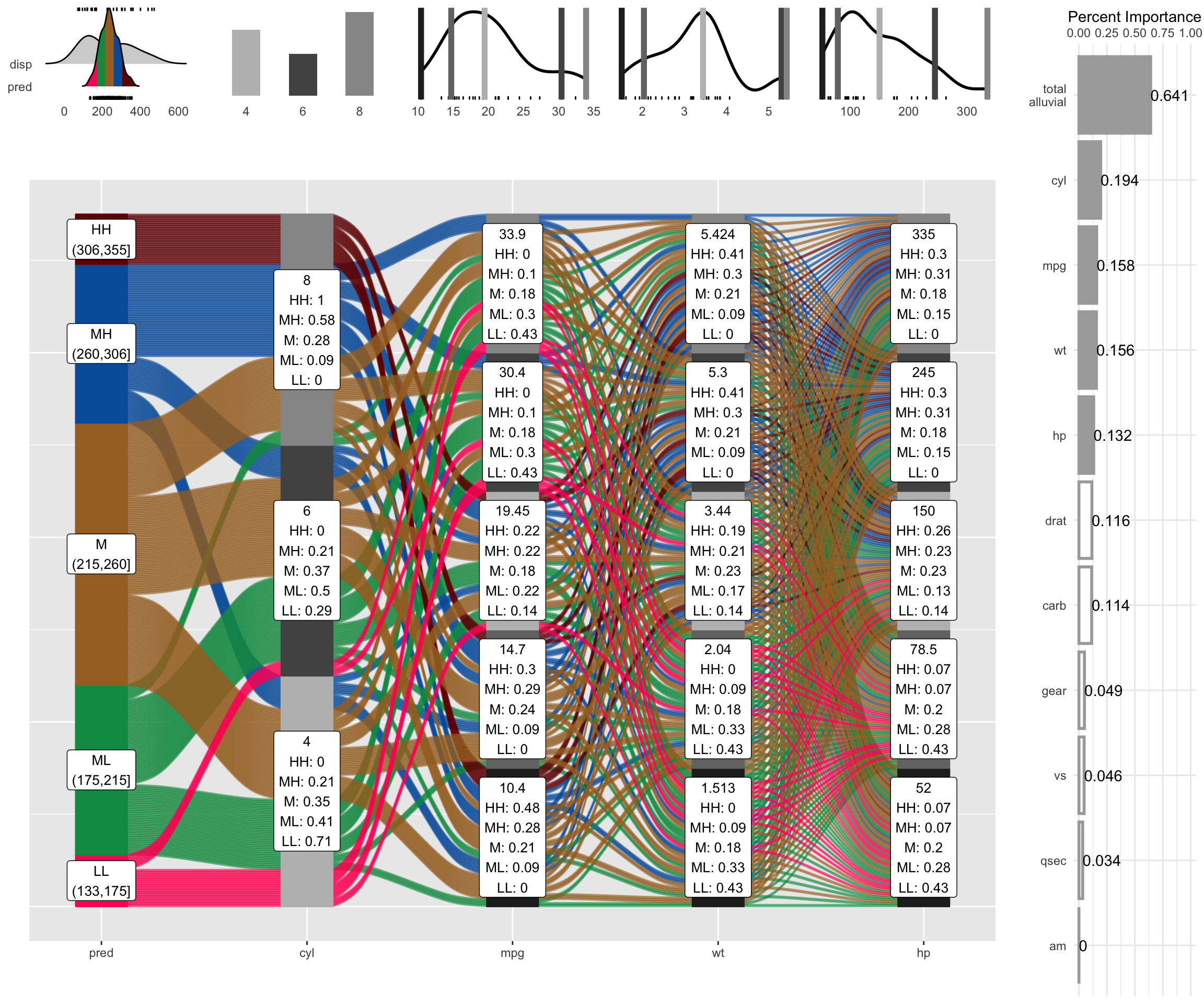
We see that the top 4 important features of the model have been selected and that 5 values have been picked over the range of the numerical variables which together with the levels of the categorical variable have been used to construct a data grid of all possible combinations.
Step-by-Step
- On the left we see the averaged model predictions that are generated by a specific combination of the 4 most important variables. You can find the combinations by tracing the coloured flows.
- The stratum label of the individual feature variables indicate the variable value and which fraction of the colored flows pass through it.
- On the right you see the feature importance of all variables and the proportion contributed by the plotted variables on the alluvial plot.
- On the top left you see how the distribution of the generated predictions compare to the distribution of the predicted variable (in this case disp) in the training data.
- The marginal histograms indicate the original distributions in the raining data and the lines indicate the location of the values picked for the data grid.
A more in-depth tutorial for this feature can be found on the project’s github page which will also be vailable on this blog in a few days.
If you are as enthusiastic about alluvial plots as me you will appreciate partial dependency alluvial plots because they can help us to get an immediate intuitive understanding how predictions of a certain range can be generated by the model. They can be understood by none-statistical stakeholders and invite the viewer to start exploring and question the decision making process of the model while also conveying an appreciation for the model complexity as flows branch out to the variables of lower feature importance. Ther are limitations though.
Limitations
- There is a loss of information when binning the numerical variables
- The combinations generated when making the grid might be outside the feature distribution space (generate combinations that are impossible)
- We only look at the combination of 4 features and disregard the others
- For a better interpretability of the feature importance it is adivable to remove strongly correlating variables and to scale, center and transform (Yeo-Johnson, Box-Cox) numerical variables, depending on the statistical model.
To alleviate this you can reduce the complexity of the model by reducing features (take out correlating variables) or use additional model exploration methods such as classical PDPs, ALE plots, Shapely values, etc, …
We do not have to use caret
Note: importance is calculated differently when using this implementation of random forest.
df = select(mtcars2, -ids)
m = randomForest::randomForest( disp ~ ., df)
imp = m$importance
dspace = get_data_space(df, imp, degree = 4)
pred = get_pdp_predictions(df, imp
, m
, degree = 4
, bins = 5)
p = alluvial_model_response(pred, dspace, imp, degree = 4, method = 'pdp')
p_grid = add_marginal_histograms(p, df, plot = F) %>%
add_imp_plot(p, df)Changes in Default Plotting Settings
Default colors have been changed. The first 7 colors of
palette_qualitative()the function that provides the default colors have hand-picked for better contrast.The stratum fill color of the variable determining the flow fill color in
alluvial_wide()hast been set to match the flow fill color.label text size can now be modified via
stratum_label_sizeparameter. Labels have gotten slightly bigger by default.
More changes
… NEWS.md
